Friday 30 March 2012

Research: Circle of Confusion by Hadjithomas and Khalil Joreige

The interactivity will be more unpredictable and interesting when viewers are allowed to participate into a working progress. Because it means that they can carry on the visual work with the artist and give their contributions to the project, which is an attractive way for visitors to join. On the other hand, it is also unsearchable and animate for the artist because of the indeterminable final effect.

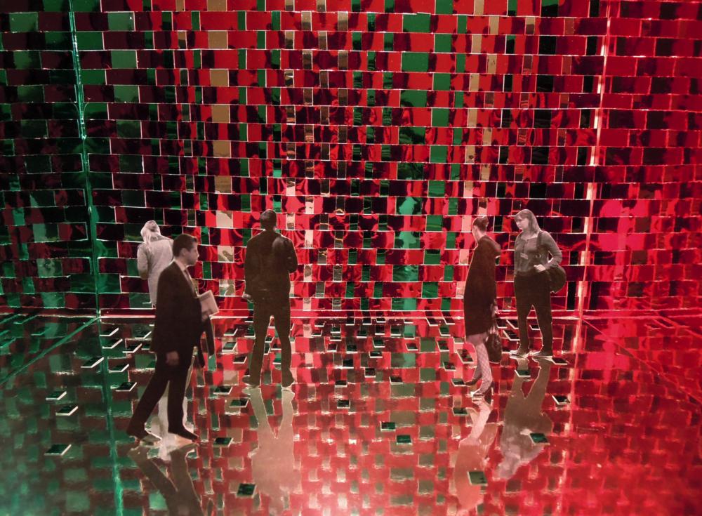
For example, Circle of Confusion is a related work that made sense by audience’s participation. It is a work about the using of image-change that designed by the artists Joana Hadjithomas and Khalil Joreige. They produced an interactive work on the legacy of political conflict in their home country. Frieling introduced that Circle of Confusion depicts an aerial view of Beirut after the war, cut into three thousands tessellated sections and attached to a gigantic mirror. On the back of each numbered fragment is the message “Beirut does not exist.” They invited viewers to remove and scatter those three thousand fragments of a photograph of the city image. Besides, when the viewer takes away a piece as a souvenir, a part of the mirror will be revealed outside. In the process of the participation of viewers, the graphic photos of the city are changed randomly; therefore, the works show a flexible and transformable interactivity between the photograph of the city, the viewers and the gallery space.

In this case, the more the mirror uncovered; the better the reflection of the context in which the installation is being shown. It means that the reflection becomes part of the image. Importantly, the definition of the room and the control of the work are grasped by audience. Audience can choose which one they want to remove, they can grasp the city and they can redefine the works by their participation. Furthermore, The artist Joana Hadjithomas and Khalil Joreige said, “every time we put this work on show, people react differently. When a person takes a piece, there is something fetishistic in this choice, but that fetishism has meaning only for the person making the choice, since it is often just a grainy bit of the photo.”

In consequence, it is effective to combine image-changing graphic system with audiences’ participation in the working process in an exhibition space. For the expression of graphic language, changing the image irregularly is a flexible way to use graphics, such as the mentioned mapping graphic system. At the same time, when viewers join in the image-changing event in process, it shows the tremendous expressive qualities of interactivity.  


Thursday 29 March 2012

ABSTRACT OF ESSAY

ABSTRACT

The purpose of the paper is to research the question that how do modern graphic language and the participation of audience interact with each other in the organization of space in the gallery. Generally, the methodology is group analysis that focuses on the three orientations, which refer to the using of space colour, the working progress by audience and the using of disorientation effects in a gallery space.

Through the specific analysis, the paper showed critical research of artist’s works as examples, such as Katharina Grosse, Kusama, George Legrady, Leandro Erlich, Esther Stocker, Joana Hadjithomas and Khalil Joreige’s related artworks. With the arguments, I came up with the viewpoint that diverse colors used into 3-D effect in an exhibition space, participating in the image-changing work in process by audience and building a disorientation in a gallery space are effective ways to aggrandize audience’s collaboration and interaction.

As a result, it can be seen that the using of graphic language changes too much in the contemporary art, and the communication between audience and a visual work becomes increasingly important, especially in a gallery space. Focusing on the interactivity, artists often use modern graphic language into a participatory work and participation art also effect original graphic design in a new way. In consequence, the graphic language can show the tremendous expressive qualities if it can be used in 3-D form and combines with audience’s participation in an exhibition space.


KEYWORDS
Participation, Interaction, Graphic language, Exhibition Space, Spatiality


Sunday 25 March 2012

"Brain Activity Exhibition" by David Shrigley at the Hayward Gallery


We visited the Hayward Gallery, and saw an amazing exhibition that is David Shrigley' work. Brain Activity is Shrigley’s first major survey exhibition in the UK and covers the full range of his work, extending beyond his drawings to include photography, taxidermy, sculpture, animation, painting, and music. In addition, Shrigley presents a number of new works created especially for Hayward Gallery, all of which are characterised by their varied use of humour and his abiding impulse to ‘communicate as simply and directly as possible’.

He is best known for his humorous drawings that make witty, wry and sometimes dark observations on everyday life. His deliberately crude graphic style has an immediate and accessible appeal, while simultaneously offering insightful commentary on the absurdities of human relationships. This part is really helpful for me, because my project is also about the real emotion of human and refers to research the new form to express it.

Shrigley's artwork engages our brains as much as it excites our sense of humour. There are a lot of objects and space design attracted me and give me inspiration to do my work.


http://www.davidshrigley.com/

http://ticketing.southbankcentre.co.uk/find/hayward-gallery-and-visual-arts/other-art-on-site/tickets/david-shrigley-brain-activity-61752


Wednesday 21 March 2012

Sigune Hamann: Wave

We visited the Welcome Collection for our tutor's WAVE exhibition which is an installation in the foyer and windows by Sigune Hamann. Featuring still and moving images of waving figures - capturing moments of joy, friendship, heartbreak and curiosity -the installation is a constantly evolving montage. 


Tuesday 20 March 2012

Disorientation 2- Progress of the Main Project

This is another installation work which also refers to the living state of modern people. I want to express that the fickle society makes people can not see themselves clearly and miss themselves in the complex and fickle word.

As I mentioned in the last post, city life is colorful and full of false appearance, which like the illusion of mirror. In this case, I used the colorful film papers and reflected light to build a illusion space. Some parts of the color are mixed together, which create a illusion that just like a complex and fickle city life. n the continued work, I am going to print the images of the urban life into the film papers and test the visual effect.

However, this is a big problem that those two models are difficult to realize in a real space because of the high price of materials and technology. In this stage, I just use the small model to carry on my idea, and then take photos inside to show the visual effects. In the next stage, I will try to find a feasible way to realize my idea, such as use projects or simple signs in a real space.


Monday 19 March 2012

Disorientation 1 - Progress of the Main Project

This is an installation work which refers to the living state of modern people. As we know, city life is colorful and full of false appearance, which like the illusion of mirror. In this case, I used the colorful mirror papers and reflected light to build a illusion space. When people enter the space, they can see themselves because of the mirror effect, just like they miss the emotion of themselves by the complex and fickle city life. 

In the future, I am going to test different forms in this model, such as add images into the space or put some mirror into the wall.


Saturday 17 March 2012

London Art Fair


This is also another London Art Fair,
there are some interesting artworks, but more of those works are for sell,
so it is a little bit commercial, not really like it!


Thursday 15 March 2012

Research : Colour Illusion research -- Katharina Grosse’s work '' Temporary wall design ''


In order to research more related artists' works for my project, I read a lot of books which talk about participation art and space design. One of the interesting books is ''Theory and Practice in the Conservation of Modern and Contemporary Art ''. Looking at Katharina Grosse’s work Temporary wall design,  introduced that the artist sprayed a veil of brilliant colours on the walls and floor of the exhibition space housing the meditative paintings of Alexej Jawlensky gallery. It can be seen that Katharina Grosse used the abstract colours into a real 3D space, which displays how the graphic language is affected in an interactive area for audience. In this work, colour is the key element that can be used to catch the viewer’s attention. Moreover, an abstract face of colour painting builds a special connection between the walls and floor, which creates a visual effect in an exhibition space. Importantly, that is also a way to communicate with audience who are affected by the simple and immediate image, because it will be psychedelic and different when people stand on the floor and face the walls. That is interactivity refers to human’s sensorial influence. 


Tuesday 13 March 2012

David Hockney's big picture at RCA

David Hockney is an English painter, draughtsman, printmaker, stage designer and photographer, who is based in Bridlington, Yorkshire and Kensington, London. An important contributor to the Pop art movement of the 1960s, he is considered one of the most influential British artists of the twentieth century.

I visited RCA and saw his exhibition. It is a really hot exhibition in London, and we waited in the queue for almost 2 hours. After the visiting, I just want to sey it is worthy for waiting such a long time, because it is really nice exhibition, which was a big visual journey. Such the amazing colours!

I like the video work very much, it had the very happy tempo and light vision, that the music, dance and colours had a nice connection and interactions. In addition, he put a lot of screens together and made up it as a whole video work. That inspire me a lot about the form the a video and the way of expression.

http://www.hockneypictures.com/


Sunday 4 March 2012

Fulham Palace

慕名而去Fulham Palace,
穿过阴冷的墓地和小树林,
来到的却是一个小到可怜的,
冷清的像冷宫一样的地方,
不过天气好的时候应该是挺美的吧。