Sunday 29 April 2012

John Stezaker

When we had the tutorial or workshop in class, tutors often mentioned the artist John Stezaker. This time we have chance to see his amazing collage works at the Saatchi Gallery. It is really different to see the real one bot only google the images in the internet. I was surprised with the exact connection of different images and the illusion of the collages.


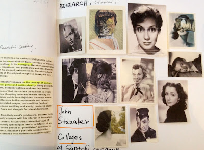
The exhibition introducted that Stezaker focuses on the concept of portraiture, both as art historical genre and public identity. Using publicity shots of classic film stars, Stezaker splices and overlaps famous faces, creating hybrid ‘icons’ that dissociate the familiar to create sensations of the uncanny. Coupling male and female identity into unified characters, Stezaker points to a disjointed harmony, where the irreconciliation of difference both complements and detracts from the whole. In his correlated images, personalities (and our idealisations of them) become ancillary and empty, rendered abject through their magnified flaws and struggle for visual dominance.

When I did my former project "Lost in life", tutor suggested me to see John Stezaker's work. At that time, I researched a lot of his collages, expecially the portrait works. When he changed a part of a portrait, used another person's head or building and landscape to replace, it looks like missing emotion of a person and someone lost something in life. That is related to my theme and it is useful to do more research.


Saturday 28 April 2012

Mid Point Review

What changes did you make following feedback you received in the Mid Point Review?

From the Mid point review, I got a lot of useful suggestions from classmates and tutors. Firstly, my study proposal has been a little bit changed from the models of the disorientation which I showed in the mid point review. My original idea was to express the theme from the urban person’s perspective. But now, I am going to express the stressful and oppressive urban life by the expression of the living environment and condition. That means I want to express the urban people’s emotion from their outside instead of human itself.

Secondly, for the installation models, there were some feedback talked about the infeasibilty of the huge model. So I did more researchs related to the space design and participation design after the mid point review. I tried to realise the model into a space by using simple image or shapes. So far, the using of projection and large installation in an interactive space are the two interesting way which I want to test and carry on my final work.
Finally, I just talked about my own work without any discussion about the research of related artists' works in the Mid Point Review. After that, I did abundant research related my theme and the way of practise, especially the space and installation design for participation and interaction.

les miserables in London

Les Misérables is an 1862 French novel by author Victor Hugo that is widely considered one of the greatest novels of the nineteenth century. Beginning in 1815 and culminating in the 1832 June Rebellion, the novel follows the lives and interactions of several French characters, focusing on the struggles of ex-convictJean Valjean and his experience of redemption.


I saw Les Misérables yesterday, it makes me feel so exciting about the story, musical vision and visual effect. All the actors had the amazing perform, they recur the classical novel smoothly with passions and created a perfect visual effect for viewers. Particularly the visual image of the stage looked like the oil paintings which were really nice. In a word, there were full of moving and exciting moments in the night.


Thursday 26 April 2012

Disorientation (Buildings)- Progress of the Main Project

This installation was created by the tier upon tier of buildings, which reflected a stressful and busy urban life. In this model, I drew the buildings on the floor and wall, expecially, I built a reflected image of buildings on the floor which looked like a mirror. It can be imagined that viewers will feel stressful and oppressive when they come into the space, and let them to think about their life in the busy city. In the future, I want to carry on the idea in a realizable way.


Tuesday 24 April 2012

No more space for the trees - A test of my main project

This is one of the developments of my main project, which is also the continued work of my installation model related the modern building illustration. In this case, I want to express that there are no more space for the trees and nature lives in a modern city because of the fast development of the building and road. Here, the buildings are intensive and tall, however, the less trees looks very lonely. This a installation which  shows a contrast in the materials color and visual effect.

When I had a tutorial with Sigune, we discussed about the idea. She suggested that if I replace the tree models to the real trees, it will be better to express my idea. I think it is a good suggestion, however, that was just a test and I don't want to continue the form in the future but I am still going to focus on the 'disorientation' one, and try to realize it in a real space.


Monday 23 April 2012

Signs and Shapes in Hong Kong

I took those photos in the easter break in Hong Kong. I am interested in the signs on the road. There are a lot of yellow lines, and the color and thickness are very strong. Just like the simple shapes show a powerful vision. On the other hand, it also show an image of the city .


Saturday 21 April 2012

Disorientation (Cage) - Progress of the Main Project

It can be seen that the space look like a cage. If viewers enter the room, they will look like a bird which stay in a constricted cage. That was the idea about “cageling”. In this stage, I am thinking about how to realise it. So I am going to use projectors to reflect it into the floor and walls in an empty room.


Thursday 19 April 2012

Sketch,ideas

Here, I kept doing my models and tried to test more expressions. This idea refered to the meaning of cage. I wanted to express that urban people’s life looked like an illusory cageling. It can be said that there are a lot of constraints in the stressful urban life. People feel unfree and chokey.


Monday 16 April 2012

'NO BRAND QUALITY GOODS'--MUJI

I visited Hong Kong in this Easter break, and the following photos I took in the outside of the MUJI at 'Harbour City'. I like this space, it looks like an exhibition space. It can be seen that the shapes, colors, and the layout are simple, meticulous, natural and comfortable and shows relaxed lifestyle, which is also the brand image of MUJI.

The Company’s basic principle is to develop new simple products at reasonable prices by making the best use of materials while considering environmental issues. Muji's natural and simple design complements today’s lifestyles perfectly.


Thursday 12 April 2012

Research: Pockets Full of Memories--'' The Art of Participation 1950 to New''

'The Art of Participation 1950 to New' is my favorite book  in the college library so far. This book introduces a lot of artists who work on participation art and shows a lot of nice works related audience's participation and communication in an artworks.


For example, there is a work called 'Pockets Full of Memories' which is George Legrady’s map work.


First of all, it is no denying that making audience join an artwork and define a space by themselves in a gallery is a way to enhance visitors’ enthusiasm, which likes a live design show worked by artist and visitors together.Harris said that to better understand vitality, we need to enter the audience. It is clear that our interactions with each other as members of an audience help to define our experience of live events. I think that an empty room has no special meaning and interactivity for people; therefore, the redefinition and reuse of a void space becomes increasingly important, which can build a new connection between the space and viewers. In this section, I am going to refer to the image-changing projects of participation in process by audience, because the combination and separation of images is a typical using of graphics. When it is used into an interactive space and related to viewers’ participation, the interactive and visual effects will be animate and surprised. On the one hand, image-changing graphic language provides a vivid and interactive way for people to participate. In contrast, artist can get more accidental effects from the working process by audience, which gives their project vitality and creativity.
Here George Legrady designed an interactive installation called Pockets Full of Memories, which focuses on a relation between digital systems of classification, semantic category and memory recall. In the gallery space, visitors are invited to scan their personal belongs and describe them by words in a database.

I consider that mapping as a typical graphic, is a developing system, which can be updated conveniently and quickly at any time. Obviously, mapping by system offers a good way to create the connection between visitors and the work, which is also an expression of collaboration by the participation of visitors. As William Owen mentioned, maps give their makers the power to define the territory in their terms. On the other hand Maps give their readers the simple and magical ability to see beyond the horizon. Particularly, they use their belongs as graphic shapes, contribute to the mapping system and make a new definition for the space. Meanwhile, the accidental and unpredictable effects will happen in the end of the work or the process of the work; therefore, people do not know what would happen, which is also the glamour of participation art. As a result, it can be seen that how to define a room or a wall is significant for creating interaction for views in a gallery space.


Wednesday 4 April 2012

Kew Garden

The building is a grass room at the Royal Botanic Kew Garden, which have a very daring geometrical structure. The modern greenhouse is very beautiful with the sky.